Published On : April 7, 2021
Android 12 Update Is Here, What’s New For Users in Options and Visuals
by: Staff Writer/ Category(s) : Smart Phones, Mobile Apps, Software
You will be glad to hear that the second developer preview of the most used Android 12 update has brought a ton of changes. Meanwhile, the thematic changes and visuals are the most obvious that users can expect. On top of these, there are various newly added settings options that have been introduced that actually improve the overall functionality for the stock Android experience. With this post, let’s catch up on the things that the Android 12 update is going to offer in terms of options and visuals for users.Read this post and know how all these few extra changes the entire game of look and feel of the upcoming Android 12.
Start With The Greyish ‘Dark’ and ‘Light’ Themes
Right from its launch, the first change that users are going to notice on Developer Preview 2 is a decent and classic greyish tint on both light and dark themes. Earlier, on Developer Preview 1, users experienced a blue tint in most of the Settings options. Have a look at the light theme first and review it.
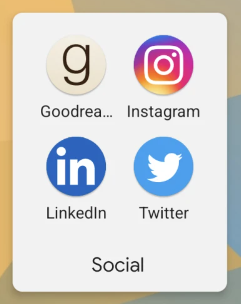
- The greyish tint reflects the app folders, meanwhile, there are certain areas where the update retains the all-white shade.
- If we consider the Folder options then, you will get to notice a slight change in dimensions, as the folders are slightly wider and easy to grab your eyeballs.
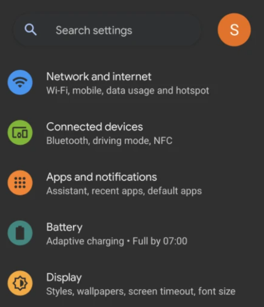
- Other than this, Google is also leaving the ‘Amoled black’ dark theme with a grey tint, just to save battery life.
- However, the WiFi sharing page is all white, even with the dark theme on.
System Accent Color Controls Media Player UI
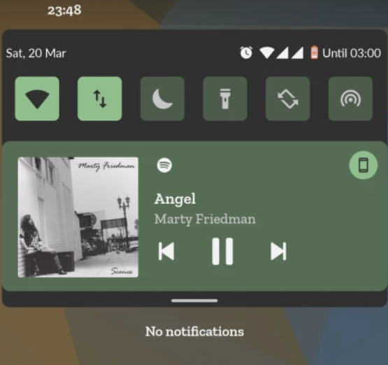
In the previous Android update, the Media Player UI colors available on the lock screen were determined by the cover art of the song. But, with the recent update, you will see the matching Media Player UI color with the system accent color. Google has addressed this theme as an eyesore as it fails to create an impact on user’s attention. One must take note that this theme is applicable both in the notification shade as well as the lock screen.
Major Changes in PIN And Pattern with Android 12 Update
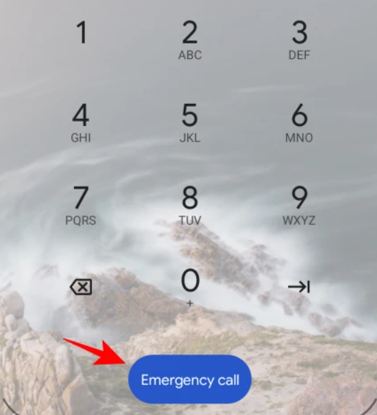

If you are the one who uses a PIN to unlock your phone, you will now be going to explore that the keypad numbers are smaller and taller with a blue color “Emergency Call” button. On top of that, the ‘Input’ button is removed. On the other hand, if you are using a lock screen Pattern, the only major thing or a change that you will see is that now your screen has thicker trail lines when drawing your pattern on the screen to unlock the phone. These ensure that you can skip any lockouts while drawing your password pattern.
A Cleaner Accessibility Menu Is What We Have Been Crave For
With the new Android 12 update, we also get a categorized and cleaner Accessibility menu. Previously, the accessibility options were bashed together just because it’s under the same hood. But now with the new update, the ‘Audio and On-screen text’ is divided into two separate ‘Audio’ and ‘Captions’ categories.
Android 12 Update – What’s New For Settings
Let’s take a look at them and understand what’s next door for the users:
‘Turn screen Darker’ Settings Page Is What You Need
The other change that’s gonna attract your eyeballs is the “Text and Display” Settings page. Why we are saying this, is because there is a new ‘Reduce Brightness’ page that will enable you to adjust the colors of your screen as per your preferences. Other options like size, theme, and contrast are also combined under a single banner.
- You can use this ‘Reduce Brightness’ page by going to the Settings icon and tapping on the Accessibility option.
- Then go to the Text and Display option.
- In the next step, Turn screen darker and then tap on the Reduce Brightness.
By implementing these steps, you will easily adjust or reduce brightness intensity with ease.
Android 12 Update Offers New Battery Icon and Options
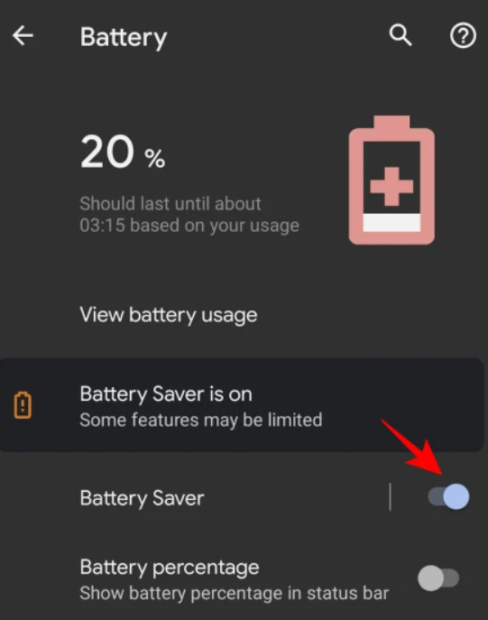
A variety of new options is also coming inside the Battery settings as well. For starters, you can experience and see your battery usage with the ‘View battery usage’ option available next to your settings page. More than this, there’s a new Battery Saver option that comes with a on or off toggle button to ease your work by saving more battery.
Wrap Up
All these newly launched visual changes and additional settings do more than just to prop up the Android experience for gadget lovers. With these changes, you can make it much easier to access options and save time.
Leave a Reply